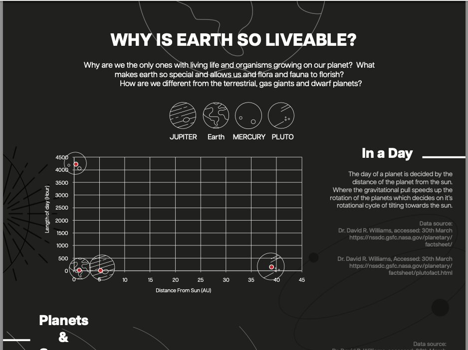
Typography zine (small magazine) based on the font "Articulate CF" designed by typographer Connary Fagun.
For my zine, I explored the font "Articulate CF" designed by typographer Connary Fagun. I chose to focus on this typeface because I loved the articulate's aesthetics, being a minimalistic, elegant font, and its potential for use in various contexts.
I want the overall visual tone of the zine to be very minimalist and clean, reflecting my preferences for visual design and the aesthetic tone of the font itself. Using white space and minimal visual elements to create an interesting layout that comforts the eyes.
I also didn't want to use any colours and only greyscale because I wanted the layout and the font to be the only things that create the design and aesthetics and not create distractions with colours. I would also like to steer away from a grid system and margins to be more experimental with the layout so that I don't trap myself in the overly clean and systematic tone of a grid.
Zine Mockup
LAYOUT DESIGN THUMBNAIL
FINAL DESIGN
